Identifying Accessibility Issues and
Suggestions for Improvement
Suggestions for Improvement
Project: AVSI - People for Development
My role: UX designer
Site link: https://www.avsi.org/en/what-we-do/countries/palestine
This is an academic project completed as part of my training, I was not directly hired or commissioned to work on it.
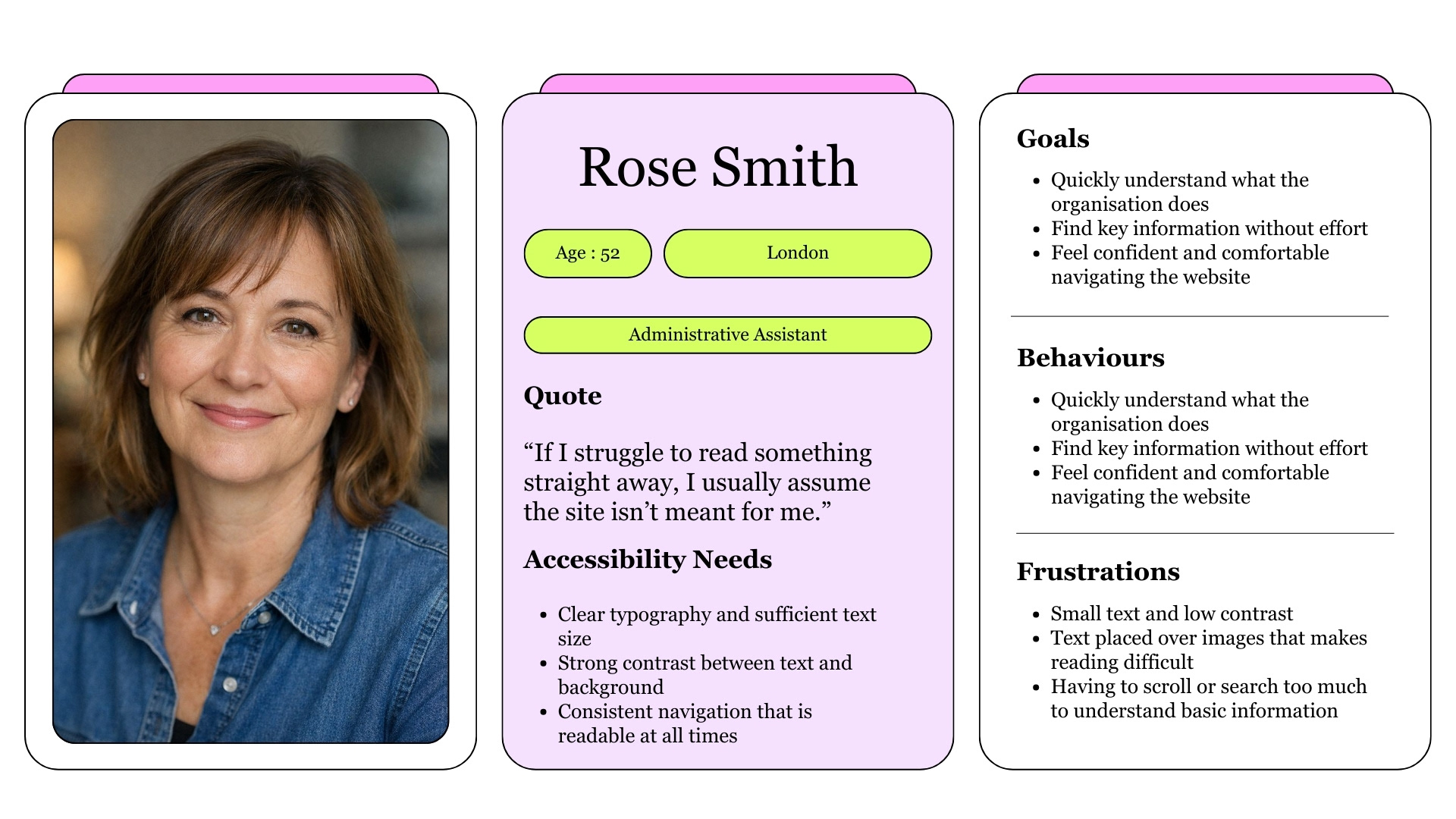
User Persona
Overview
Business Need
Make the website easy to read and accessible for everyone, without losing the organisation’s identity.
A clear and accessible design helps people find information quickly, understand the message, and feel welcomed. When the interface stays out of the way, users can focus on the cause rather than struggling with navigation, contrast, or readability, no matter their device, background, or abilities.
A clear and accessible design helps people find information quickly, understand the message, and feel welcomed. When the interface stays out of the way, users can focus on the cause rather than struggling with navigation, contrast, or readability, no matter their device, background, or abilities.
Design Problem
Some text elements, such as navigation items and button labels, were hard to read when placed over image backgrounds. The contrast was often too low and the text too small, especially before scrolling. While readability improved after scrolling, the initial view could make key information easy to miss, creating friction for some users from the very first interaction.
Proposed Solutions
- Increase text size and refine typography to make content easier to read.
- Slightly adjust colour values to improve contrast while preserving the original brand identity.
- Use consistent white backgrounds behind key text elements, such as navigation, to keep information readable in all states.
- Improve button text contrast so calls to action are clearer and more accessible for everyone.
Improved contrast
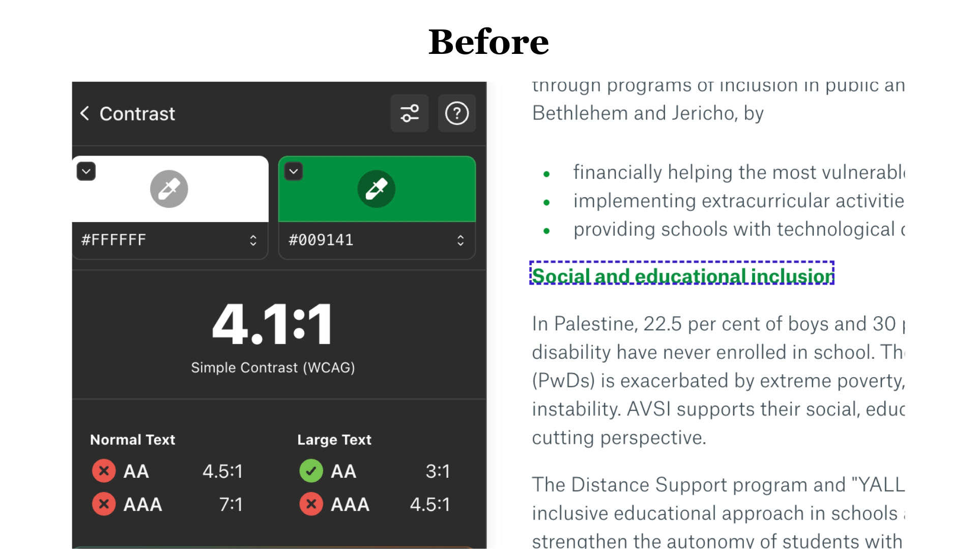
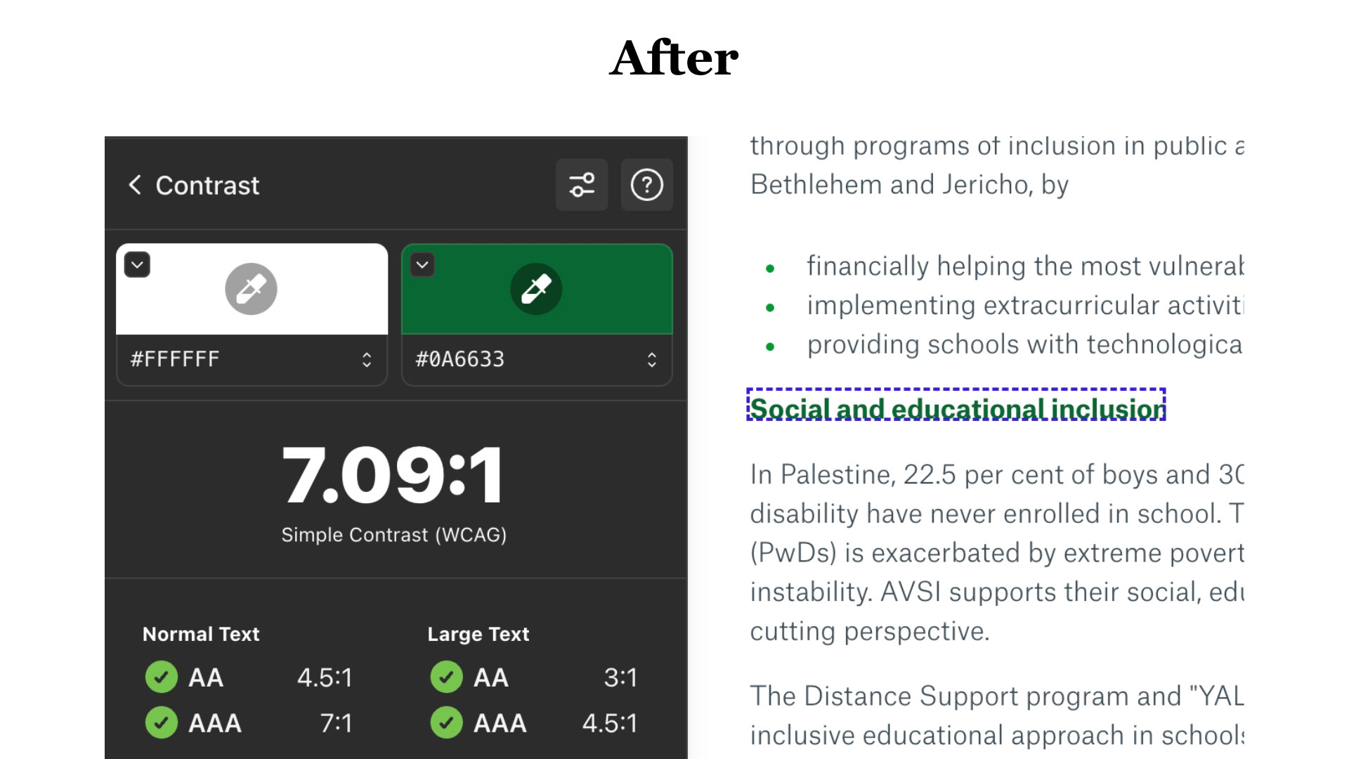
The color chosen for some text elements, such as the one considered here, had insufficient contrast against a white background. By slightly darkening the color, the contrast ratio increased significantly without altering the original color identity, improving from 4.1:1 to 7.09:1.
Improved Button text colour
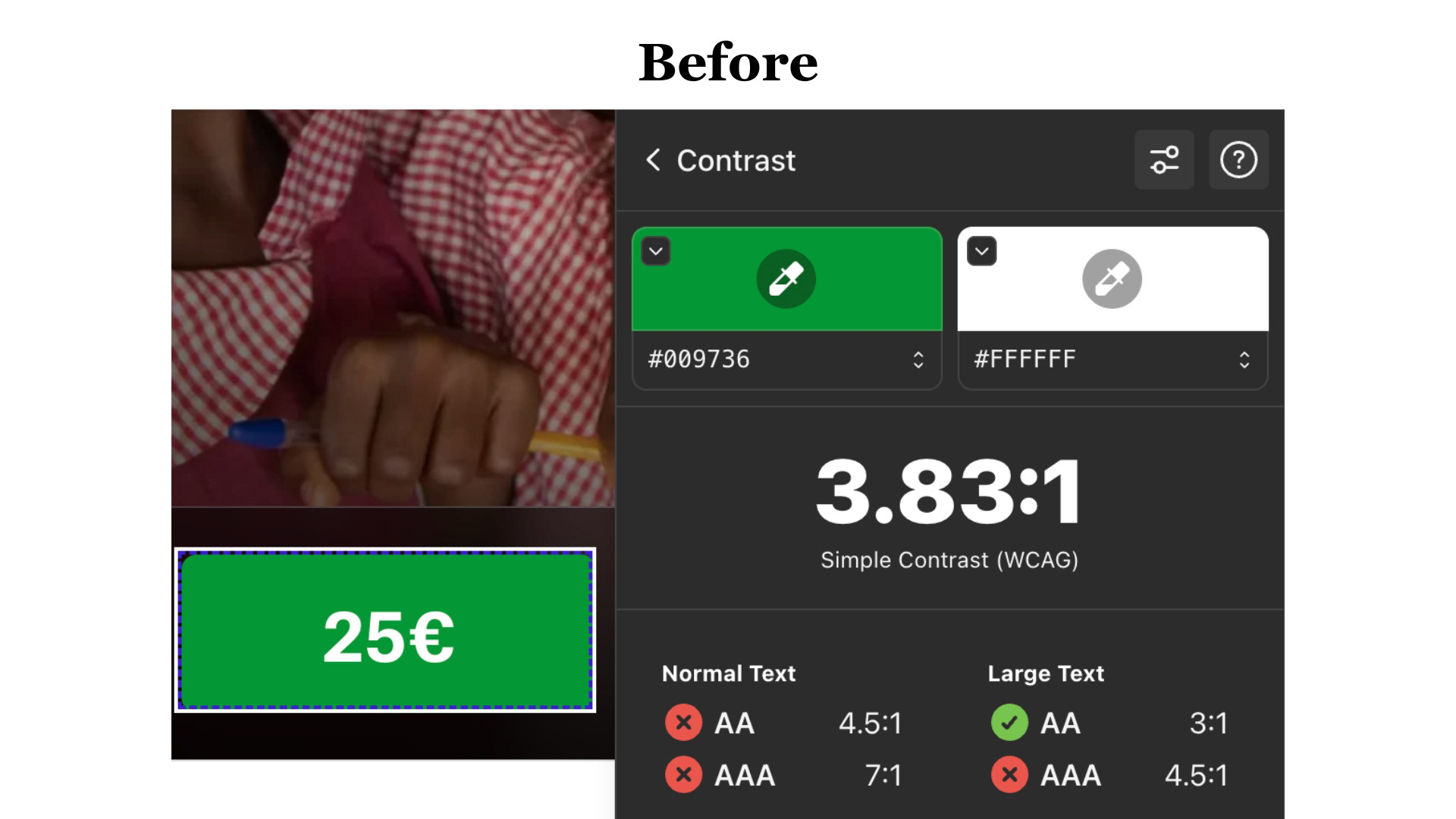
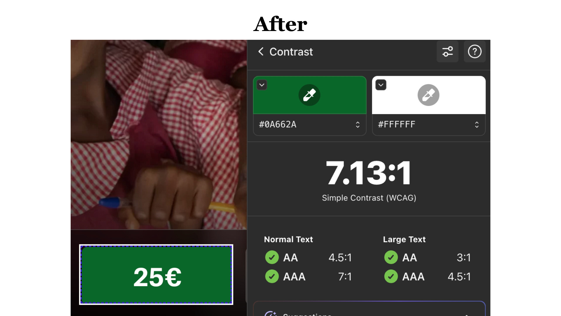
The text inside the button had insufficient contrast against its background. By slightly adjusting the color, the contrast ratio improved from 3.83:1 to 7.13:1, significantly enhancing readability and accessibility without altering the original visual identity.
Hero screen
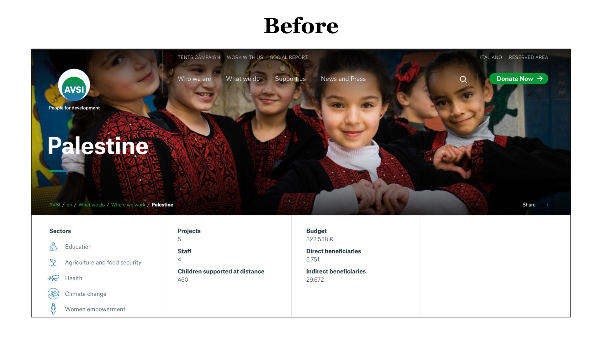
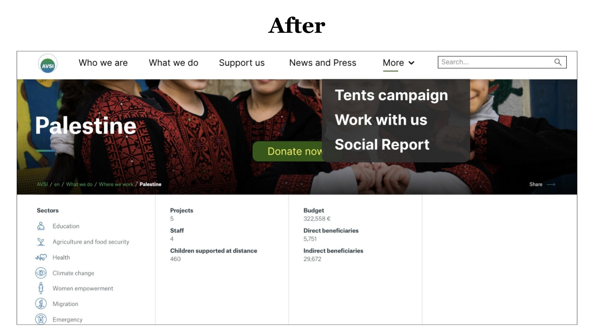
When users first land on the website, their attention naturally goes to the top navigation. Not because it stands out visually, but because the readability issue is immediately noticeable. The text appears too small and too light when placed over the background image, making it harder to read at a glance.
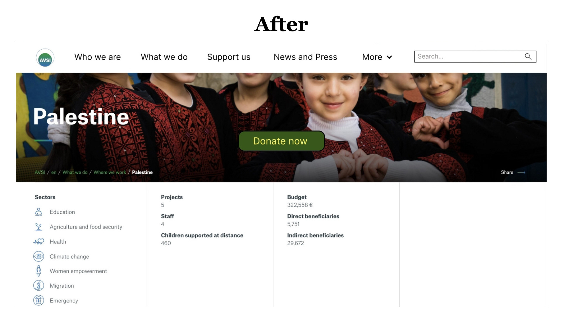
In the redesign, a consistent white background was applied to ensure the navigation remains readable in all states. Navigation items were increased in size and darkened to improve clarity. Secondary items were grouped under a “More” button to reduce visual clutter and simplify scanning. The donation call-to-action was repositioned and enlarged to increase visibility and encourage interaction, while the search bar was made more prominent to support quicker access to content.
Challenges
One of the main challenges was improving accessibility without altering the organisation’s visual identity. Small changes in contrast, typography and layout needed to be carefully balanced to respect the existing brand while still addressing real usability issues.
Key Learnings
This project reinforced how small design decisions, such as text size, contrast, and background treatment, can have a big impact on readability and first impressions. Accessibility is not just a technical requirement, but a key part of making users feel confident and welcomed from the very first interaction.