Redesigned LazyHat checkout page for responsive screens, leading to a 100% task completion rate across usability testing sessions
LazyHat Redesign Project | UX/UI designer | 2026
Role
UX/UI designer in a team
Industry
E-commerce
Duration
3 weeks
Tools:
Figma | Miro | Claude | Clarity | Google Analytics | Google Meet | Google forms
Project goal:
This project was carried out in collaboration with a fellow UX designer. The goal was to improve LazyHat's checkout experience by reducing friction, increasing clarity, and strengthening user trust, with a focus on creating a smoother and more transparent flow to support higher conversion rates.
The problem:
Users encounter points of friction during LazyHat's checkout flow due to unclear information hierarchy and unexpected form requirements. These issues increase cognitive load and reduce user confidence, disrupting the most critical stage of the purchase journey.
Double Diamond Process:
Discover
The discovery phase included internal alignment, stakeholder interview,s competitive analysis, a user survey, and exploratory usability testing, all focused on understanding how users navigate and experience the checkout flow.
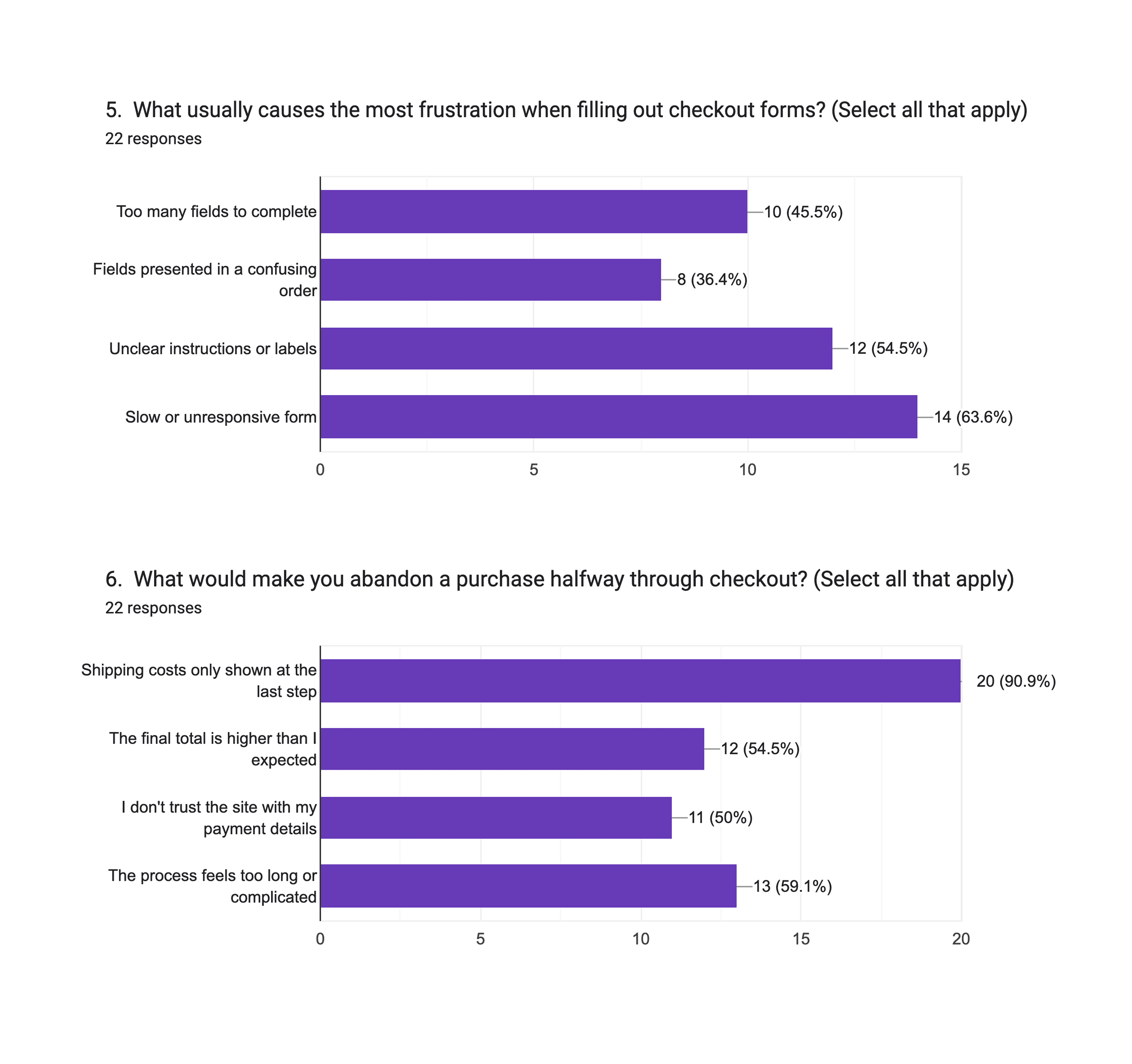
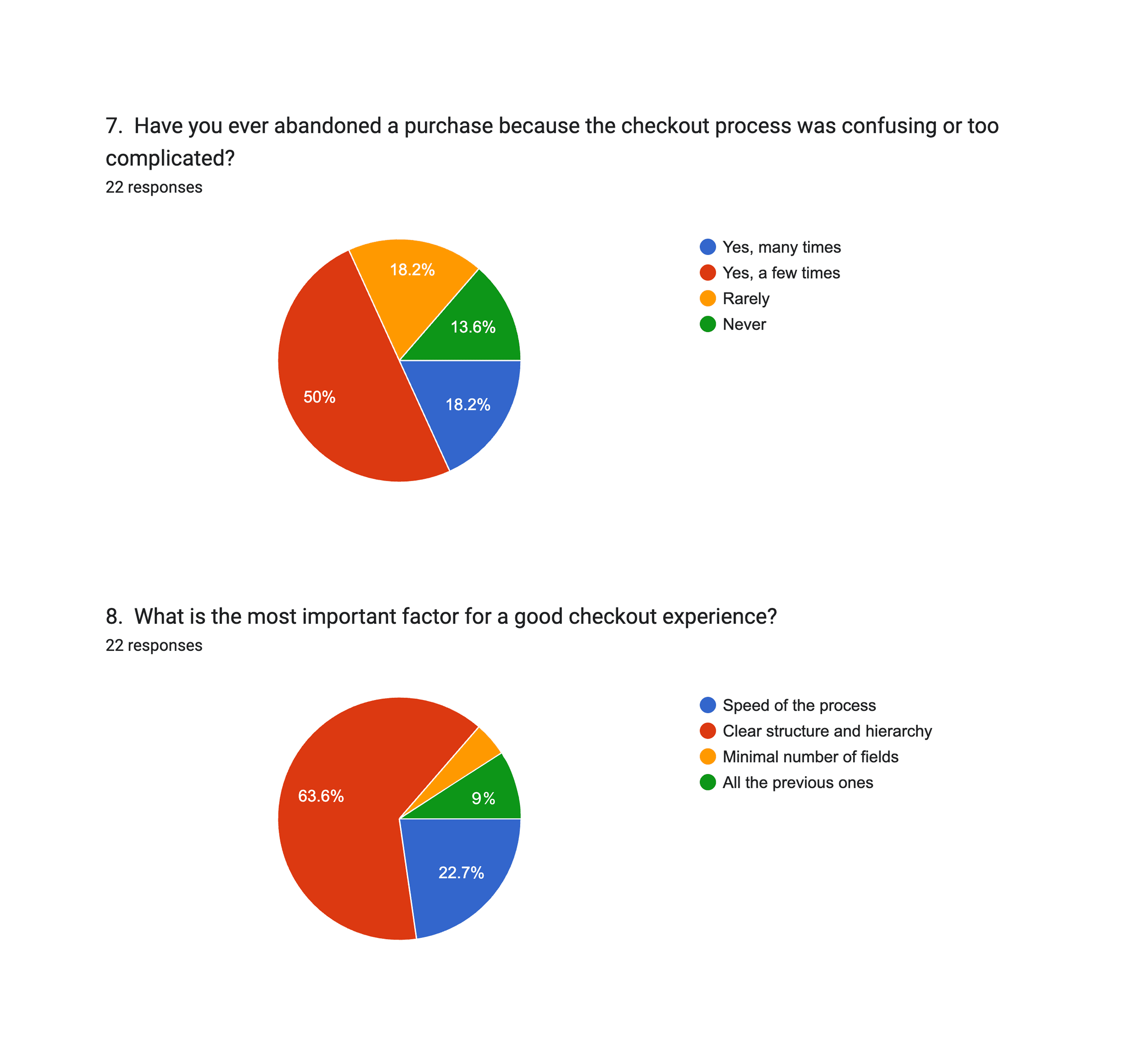
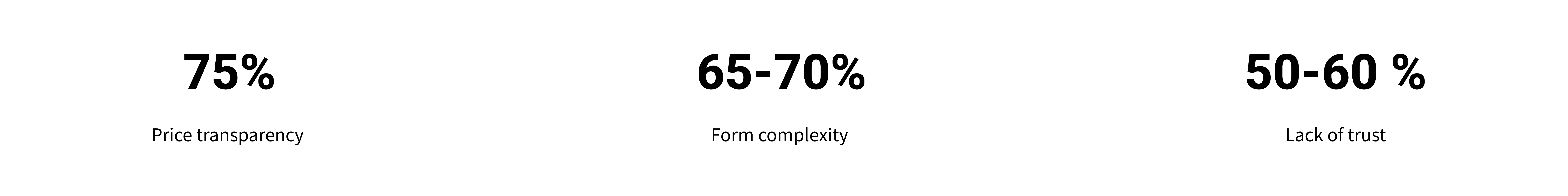
User Survey
To have a clearer understanding of how users experience online checkout and what drives them to abandon a purchase, we launched a quick survey. We collected 22 responses that helped us identify recurring patterns and surface key friction points.
User Survey
Four moderated interviews were conducted to observe real user behaviour within the existing platform. The sessions revealed consistent usability issues affecting the checkout experience, reinforcing the survey findings.
Define
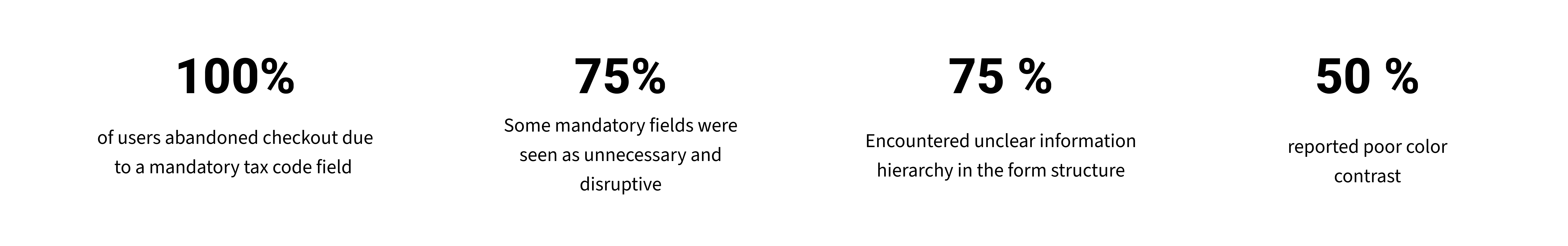
Research insights were synthesised to prioritise the key friction points within the checkout flow. The main issues identified were:
Inconsistent information hierarchy across form fields
Several unnecessary mandatory fields, including an unexpected tax code request
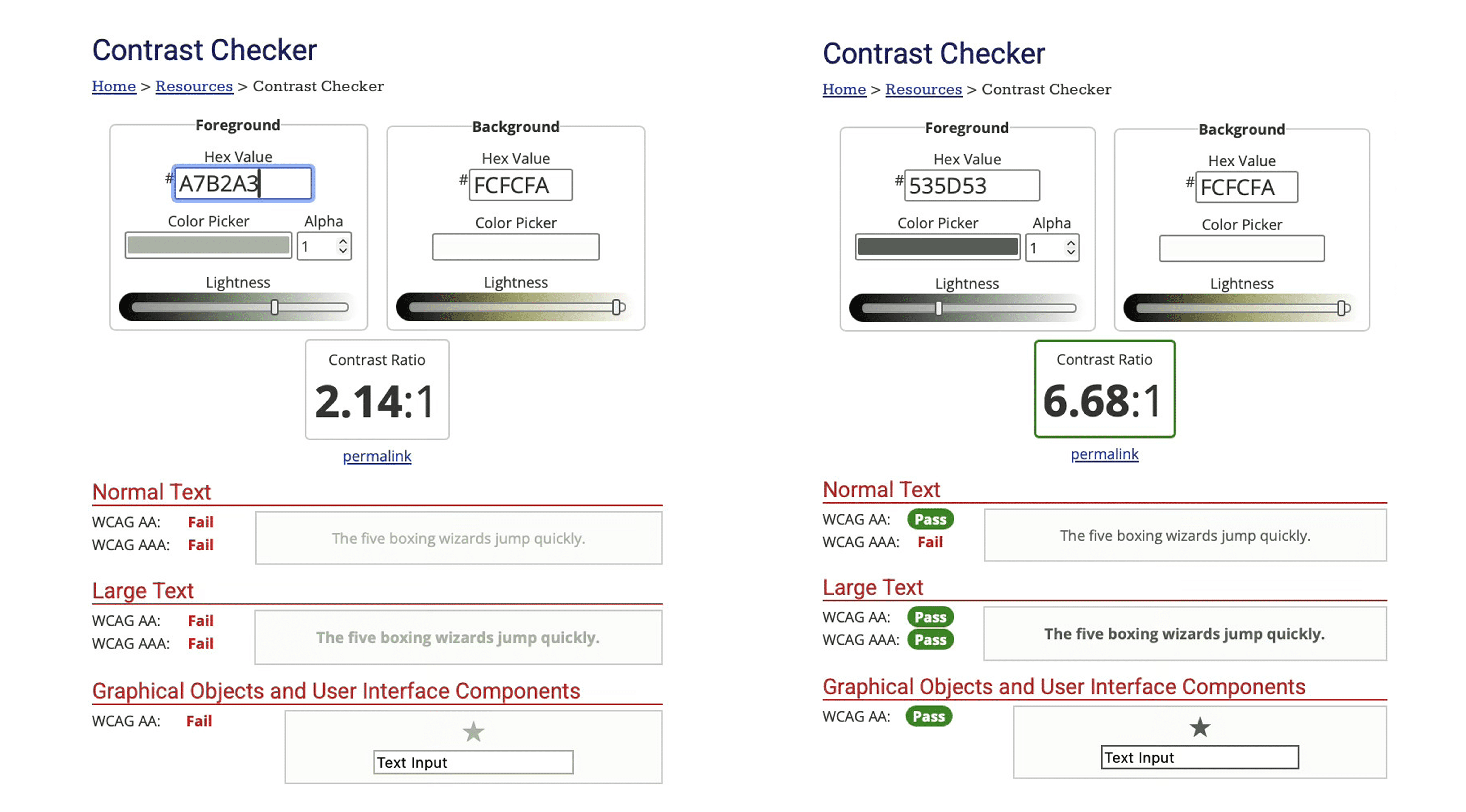
Insufficient colour contrast on the primary call-to-action button, flagged against WCAG accessibility standards
These became the foundation for the design decisions in the following phase.
Develop
Design solutions focused on four key interventions within the checkout flow:
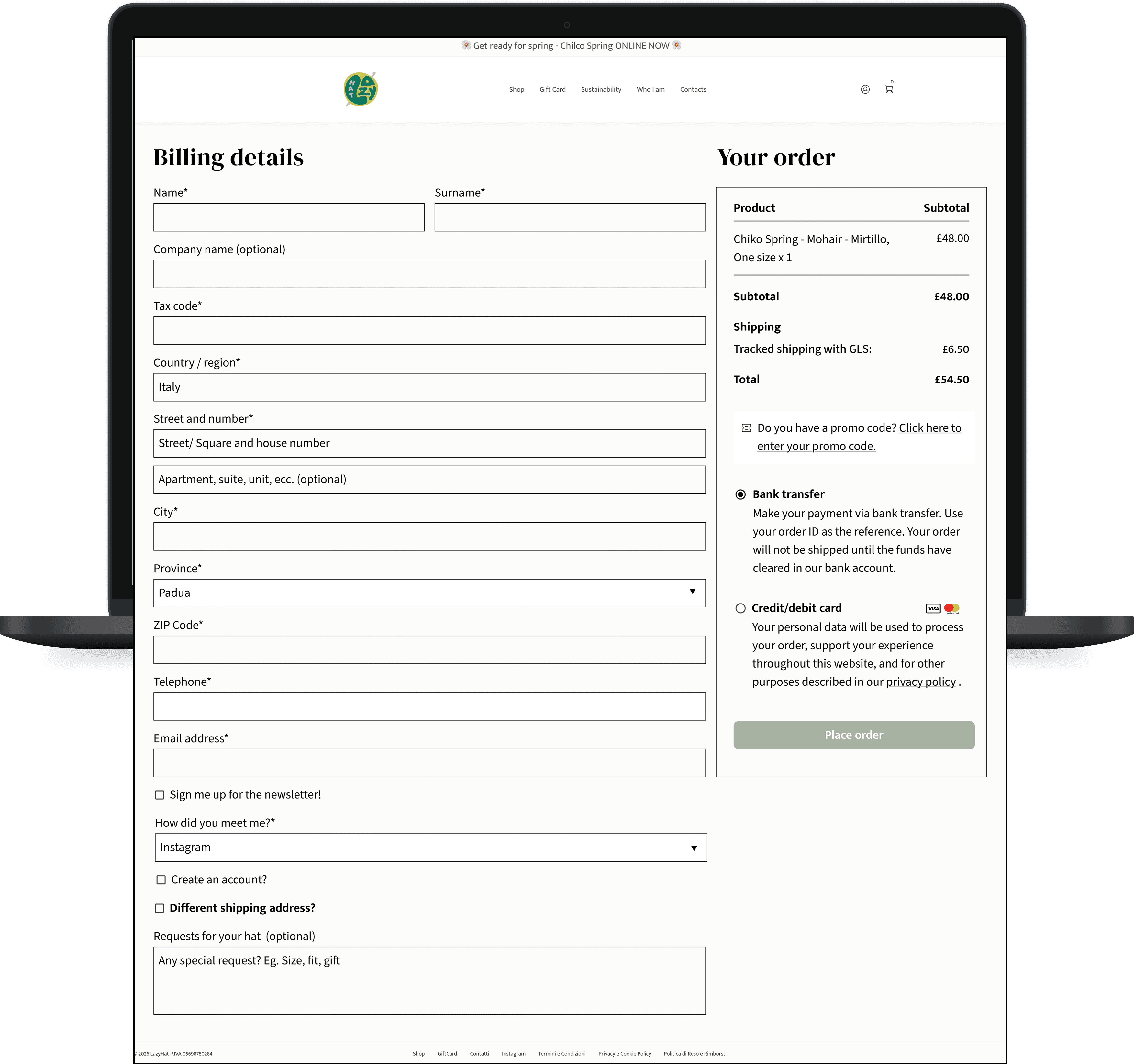
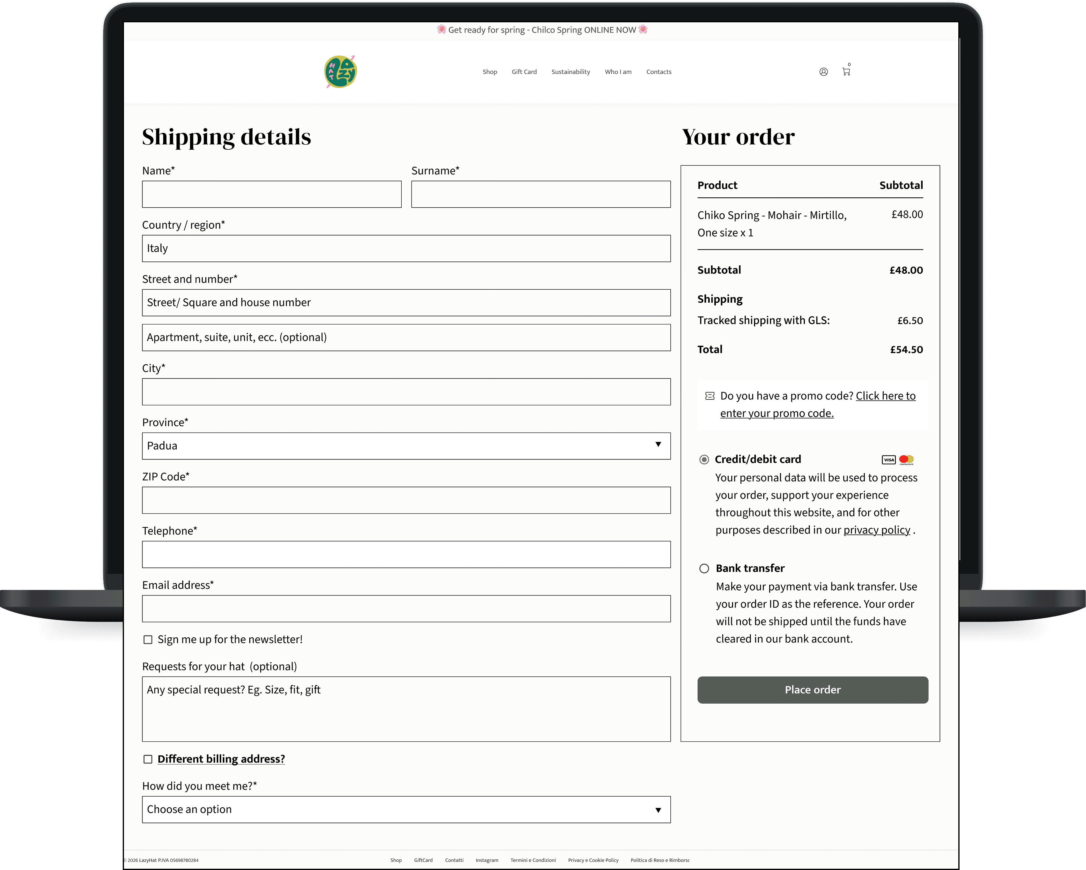
Form fields were reorganised to reflect a clearer and more intuitive hierarchy, reducing cognitive load across the process.
Unnecessary mandatory fields were reclassified as optional or removed entirely, including the tax code field, identified as a primary cause of user abandonment.
Insufficient colour contrast on the primary call-to-action button was flagged to the client as a WCAG accessibility issue, with a recommendation to update the colour accordingly.
Deliver
The final deliverable focused on the data entry step of the checkout flow, the stage where friction was most concentrated. The solution moved through mid-fi wireframes to a hi-fi prototype, and was subsequently implemented directly on the live site. A WCAG accessibility report flagging the contrast issue on the primary call-to-action button was also delivered as a separate recommendation to the client.
Outcomes & Key Metrics:
A usability test conducted with 4 users confirmed that the redesigned checkout flow was completed without friction or hesitation. The project successfully translated key friction points into concrete design improvements, including a simplified form structure, a revised field hierarchy, and a reduced set of mandatory inputs. Success for this project would be measured through checkout completion rate, drop-off rate, time to complete, and form error rate, alongside qualitative indicators such as perceived trust and confidence.
Reflections:
Challenges
The main constraints included limited access to real behavioral data, such as Google Analytics, and a dependency on the site owner for implementation, which slowed the ability to iterate quickly.
Learnings
This project strengthened our ability to manage a collaborative design process across two designers, and to work effectively within the constraints of a real client relationship. It also highlighted the importance of structuring stakeholder communication early to maintain momentum throughout the project.
Future Considerations
In future projects, we would establish success metrics at the outset and negotiate direct access to the site earlier in the process, to reduce dependency on third parties during implementation.
Other projects

Designed a mobile travel app for independent travellers using AI as a partner across research, feature definition, and UI design
Wander | UX Designer | 2026

Designed Perfect Properties, a responsive web app that helps first-time property investors find, evaluate, and shortlist listings with confidence
Property Project | UI designer | 2026

Humania: A platform to access expert services by exchanging skills. 91.7% task completion rate.
Humania Project | UX/UI designer | 2026