Designed a mobile travel app for independent travellers using AI as a partner across research, feature definition, and UI design
Wander | UX Designer | 2026
Role
UX Designer
Industry
Travel & Tourism
Duration
2 weeks
Tools:
Claude and ChatGPT (AI research and ideation) | Figma Make (wireframes and high-fidelity screens) | Figma Design (refinement and layout)
Overview:
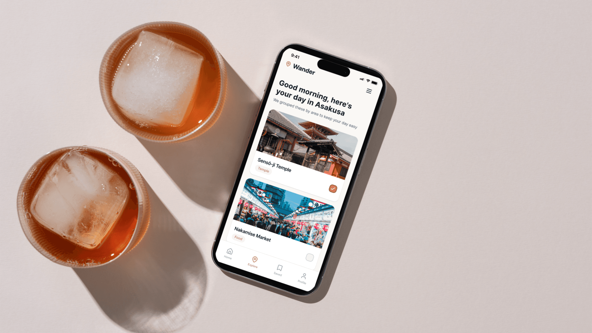
Wander is a travel companion app designed for independent travellers who want to explore without being overwhelmed. Instead of building rigid day-by-day schedules, Wander lets users save the places they want to see and organises them automatically by proximity, so every morning they open the app, find a suggested list for the day, choose what feels right, and go.
The project was developed as part of the IxDF AI for Designers course, using AI as a research accelerator and design thinking partner throughout the process. All design decisions, feature selection, user flows, content hierarchy, and visual direction, were defined before and during the AI-assisted production of wireframes and high-fidelity screens.
The problem:
Travelport's 2024 report found that available travel products grew from 500 in 2010 to over 10,000 today. 58% of travellers feel overwhelmed by choice, and 71% feel anxious after booking. Meanwhile, the European Travel Commission found that 51% of Europeans are actively avoiding overcrowded hotspots, but no existing tool helps them do that meaningfully. People want to explore freely. Current tools make that harder, not easier.
Research:
Research was conducted using Claude and ChatGPT, as an accelerator to map the problem space and identify patterns across published data, cross-referenced with primary sources including Travelport's 2024 report, the European Travel Commission's 2024 sentiment data, and IJRIAS research (August 2025). Two moments defined the direction: pushing back on the AI's tendency to default to AI-powered solutions, which opened up more grounded design territory, and explicitly requesting a European perspective, which surfaced the over-tourism angle and reframed one of the two core features entirely. Limitation: no primary user research was conducted.
Define:
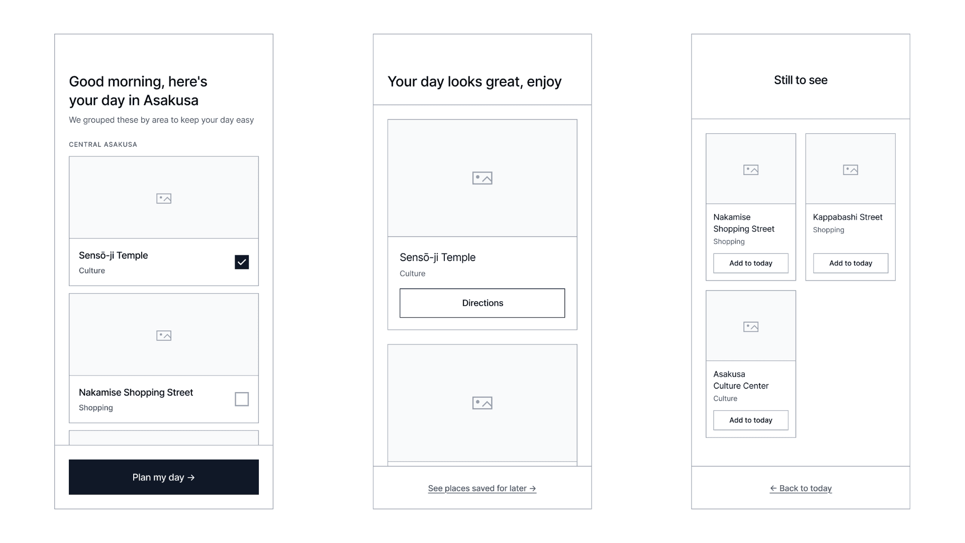
From the research, four HMW questions and four user stories were developed, generating a long list of ten potential features. These were prioritised down to two core features: proximity-based daily planning, the app automatically groups saved places by area so every day makes geographical sense, and alternative destination discovery, which flags over-tourism risk and surfaces peer-sourced alternatives for travellers wanting to avoid overcrowded hotspots.
User Flow:
The flow runs from onboarding, account creation and a short travel style quiz, through trip setup, highlight selection, and density preference, to a loose framework generated around the user's saved places. The app then runs a crowding check, suggests alternatives for at-risk highlights, and builds the final itinerary ready to save and share.
Design Process:
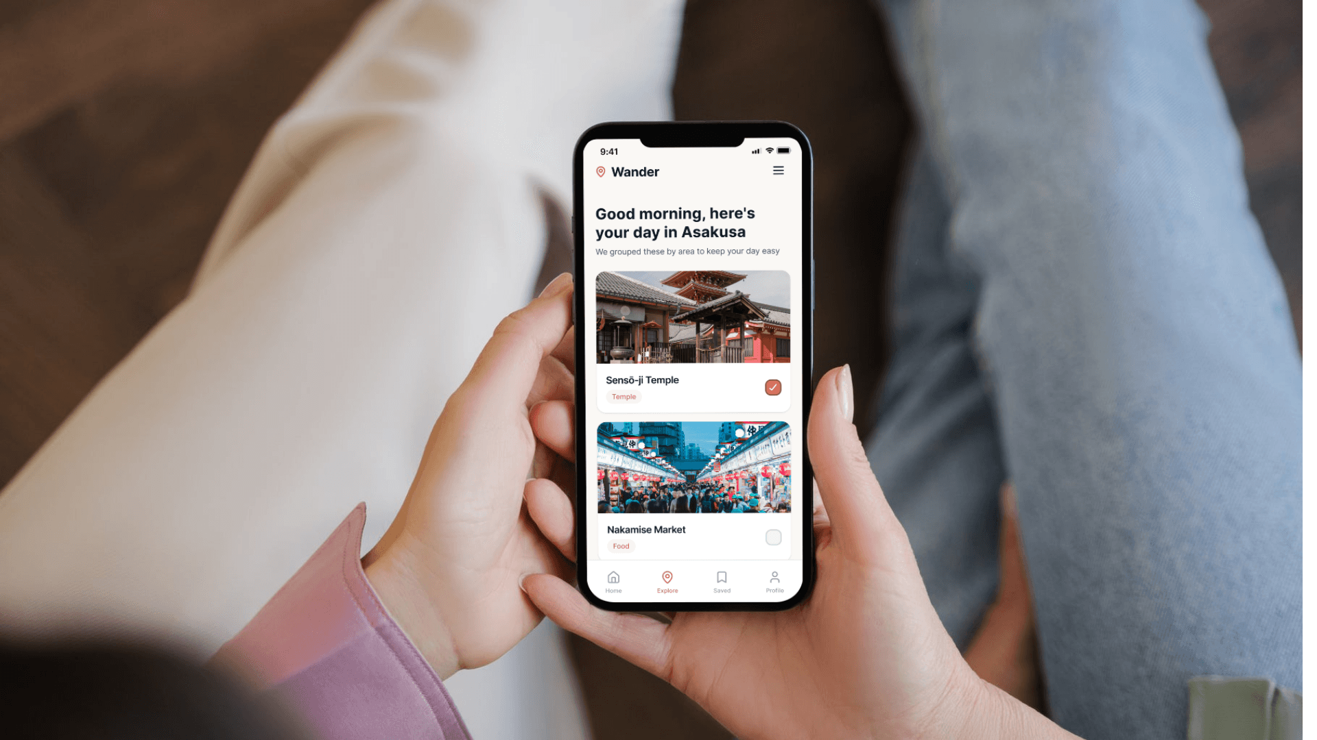
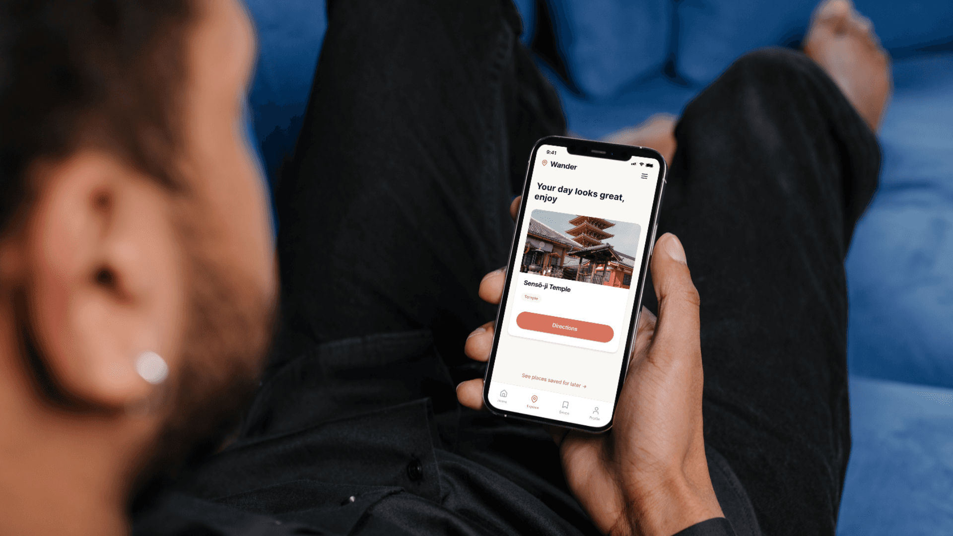
Wireframes were produced initially as mid-fidelity for the three core screens: Morning Selection, Day Planning, and Saved for Later. Each screen was generated using Figma Make through detailed prompts written after defining the UX logic, content hierarchy, and interaction model. Key design decisions included choosing to keep the interface simple and action-oriented, without asking users to categorise or track their decisions and choosing a warm, vibrant palette to make the experience feel joyful and light rather than task-driven.
Hi-fi screens:
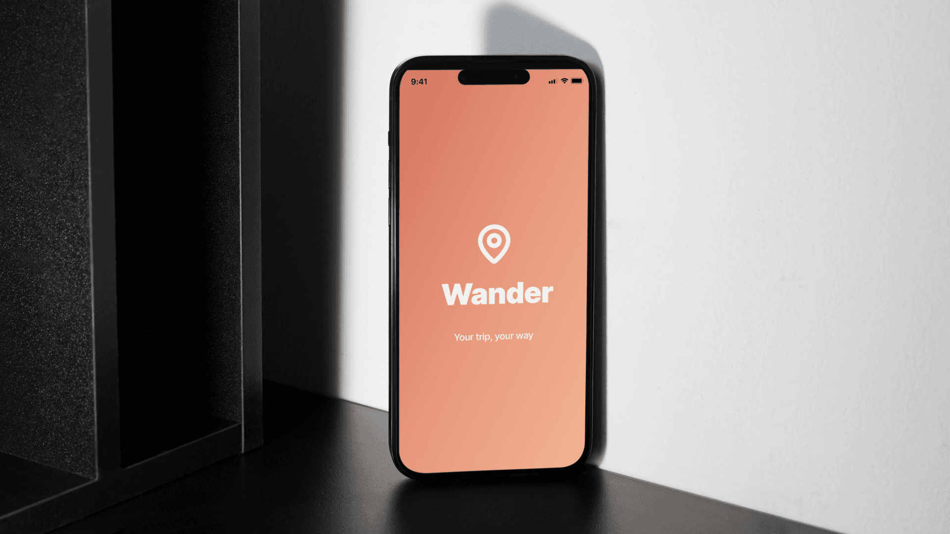
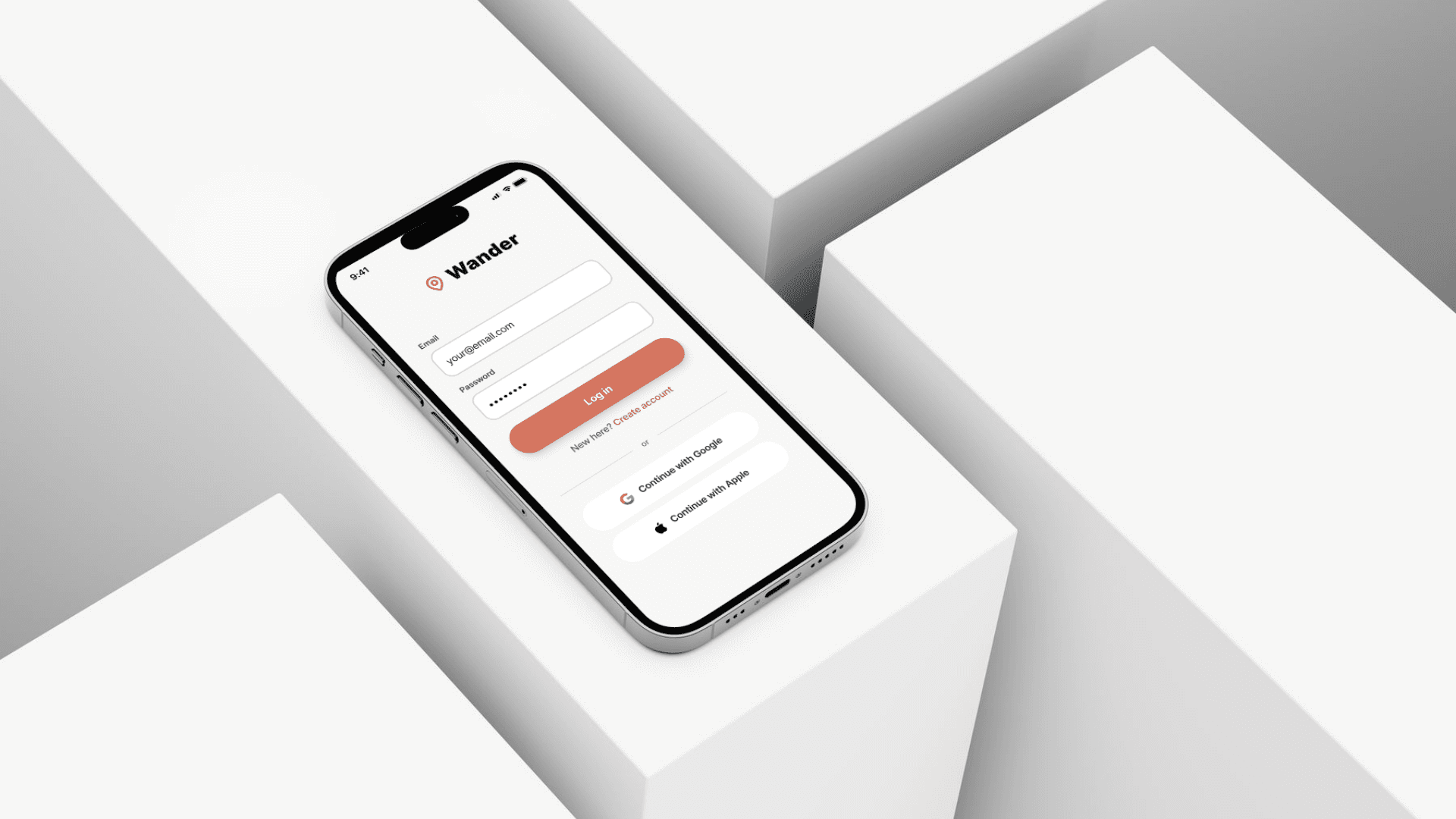
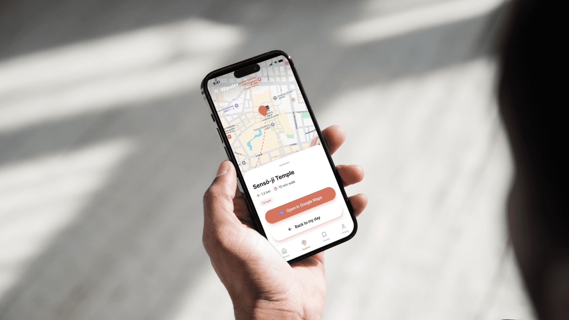
Six high-fidelity screens were produced: Splash Screen, Login, Morning Selection, Day Planning, Saved for Later, and Directions. The visual direction uses a warm palette, chosen to make the experience feel energetic and inviting rather than clinical. Typography is bold and friendly, with clear hierarchy. Every screen follows a consistent native app structure with a top bar carrying the Wander Logo on the left and a bottom tab navigation. The Directions screen integrates a map placeholder with a bottom sheet showing destination details and a direct link to Google Maps, keeping the transition from planning to navigation as frictionless as possible.
Reflection:
This project was as much about developing a new skill as it was about designing a product. Working with AI throughout the entire UX process, from research to feature definition to prompt-driven wireframing, pushed me to think more precisely about every decision. To get useful output, I had to be clear about what I actually wanted, which meant understanding the problem better before asking the question.
What surprised me most was how much the process sharpened my design thinking. Writing a prompt that produces a useful result requires the same clarity as writing a good brief. The better I got at articulating the problem, the user, and the design intent, the better the collaboration became, and the more the output felt like a genuine extension of my thinking rather than a starting point to react to.
Other projects
Redesigned LazyHat checkout page for responsive screens, leading to a 100% task completion rate across usability testing sessions
LazyHat Redesign Project | UX/UI designer | 2026

Designed Perfect Properties, a responsive web app that helps first-time property investors find, evaluate, and shortlist listings with confidence
Property Project | UI designer | 2026

Humania: A platform to access expert services by exchanging skills. 91.7% task completion rate.
Humania Project | UX/UI designer | 2026